
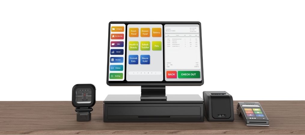
Button Mapping, Modifiers, and Workflows That Actually Matter
A POS system is only as fast as the layout behind it. Two restaurants can run the same hardware and software and still see very different order times, simply because one has a layout designed around real service patterns and the other is still running the default setup from installation day.
In this blog, the team at Pineapple POS breaks down how smarter button mapping, cleaner modifier menus, and service-focused workflows can reduce unnecessary taps, speed up order entry, and make the POS easier for your staff to use when the restaurant gets busy.
Group Buttons by Frequency, Not Just Category
Popular items should be one tap away, regardless of which menu category they technically belong to. Burying a top seller three screens deep costs time on every single order.
This often means breaking from a strictly logical menu structure. A best-selling appetizer might deserve its own prominent spot even if it technically belongs on a shared “starters” screen.
Simplify Modifier Screens
Modifiers should follow a logical, consistent flow — size, then temperature, then extras — so staff don’t have to think through a new pattern for every item. Inconsistent modifier ordering is one of the most common sources of small, repeated mistakes in a POS setup.
Color-Code for Speed
Visual grouping by color helps new staff learn the system faster and reduces the chance of hitting the wrong button during a rush. Color-coding also helps veteran staff work faster on autopilot, relying on visual pattern recognition rather than reading every label.
Build Workflows Around Real Service Patterns
The best POS layout mirrors how your specific restaurant actually operates — a bar service flow looks different than a full-service dinner flow. A high-volume bar needs fast access to drink modifiers and tabs; a full-service dinner room needs a layout built around course timing and table management.
Revisit the Layout as the Menu Changes
A layout that worked at opening can quietly become outdated as menu items are added, removed, or reprioritized. A quick seasonal review keeps the most-ordered items front and center instead of buried under menu changes made months ago.
Treating Layout as an Ongoing Process
Button mapping isn’t a one-time setup task — it’s a living part of how a restaurant runs. The restaurants that get the most speed out of their POS treat the layout the same way they treat the menu itself: something to revisit, test, and refine as the business changes.
Ready to redesign your POS layout for speed? Contact Pineapple POS to get started.
Frequently Asked Questions
Restaurant POS buttons should be organized around how employees actually enter orders. Frequently ordered items should require as few taps as possible, while related items and modifiers should follow a predictable flow.
POS button mapping is the process of deciding where menu items, modifiers, functions, and shortcuts appear within the POS interface.
A well-designed POS layout reduces the number of screens and taps required to complete an order. Keeping high-volume items accessible, simplifying modifiers, and matching workflows to actual service patterns can help staff enter orders more efficiently during busy shifts.
There is no ideal number for every restaurant. Modifier lists should include the choices staff genuinely need while avoiding unnecessary options that slow down order entry.
Yes. Consistent modifier sequences, clearly labeled buttons, logical grouping, and required selections can make it harder to skip important order details.
In some restaurants, yes. Bartenders, servers, counter staff, and managers may perform very different tasks. Role-specific screens or shortcuts can keep frequently used functions accessible without cluttering every employee’s interface.